Could It Be Beautiful? Yes — And It Should Be
Health design isn’t exactly every designer’s dream job. Let’s be honest.
Too many constraints. Too many approvals. And sometimes the subject matter is just plain heavy. Disgusting, depressing, boring — depends on the day. Even I find it odd sometimes, when someone asks what I do and I reply:
It doesn’t usually draw a crowd. Not many designers are drawn to this field — most leave as soon as they can. Which is a shame.
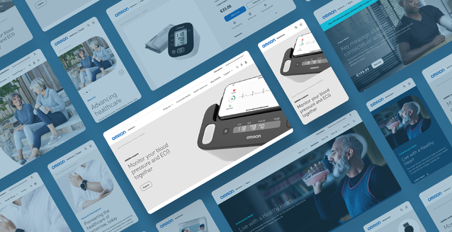
Because in this field, how you show something really matters. Not to make it “look better” — but because these materials are often seen by people who are exhausted (doctors, pharmacists), uncertain, or sick. And if they have to watch or read something, it might as well be something that feels good to look at, and easy to use.
I once worked on an animation with a colleague of mine, Bálint — it was about catheterization. (Well, mostly he worked on it, I mostly watched — minor detail :) )
Not exactly a glamorous topic. And yet… we managed to make it beautiful.
Nothing fancy — just something that’s pleasant to look at. And it still conveys the same information, precisely and correctly. Only now, it doesn’t hurt to look at. It doesn’t repel. It’s watchable and...
I don’t think people believe beauty is harmful — they just think it’s not important. As long as something is correct and professional, that should be enough. Design should be “fine,” but not interfere with the content. But we forget that just like in any other part of life, we enjoy beautiful brochures, infographics, websites — it’s no different here.
I’ve come to love this field, even if it isn’t easy.
Those who know me have probably heard me say a thousand times:
“We don’t do campaigns for Pöttyös. Where there’s a curd bar, covered in chocolate — and that’s been the case for thirty years.”
I feel lucky. In most creative industries, you have to build a story around empty content. And everything is subjective.
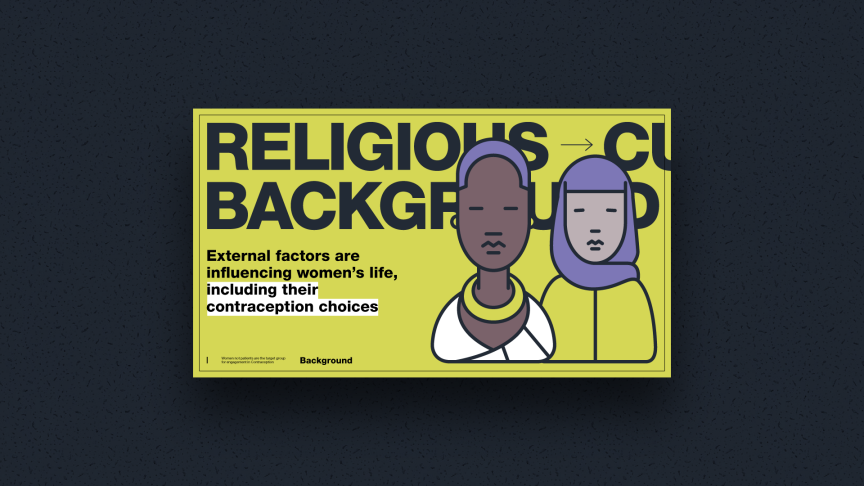
But here, the topic is very real, very difficult, very interesting.
And if we manage to show it in a way that doesn’t dilute the content — but adds some balance, subtlety, care — that feels amazing.
(And if I want to “express myself,” I don’t do it on the client’s budget — I go home and draw.)
And in those moments when someone has to watch a video or go through a deck — because they’re a doctor, or a patient —
at least there’s something that makes the whole thing a bit more pleasant.